If you are a fan of our blog - I know most of you are not, because our blog is still a baby, but I do hope you will be obsessed by her at some point - you will remember this plot:
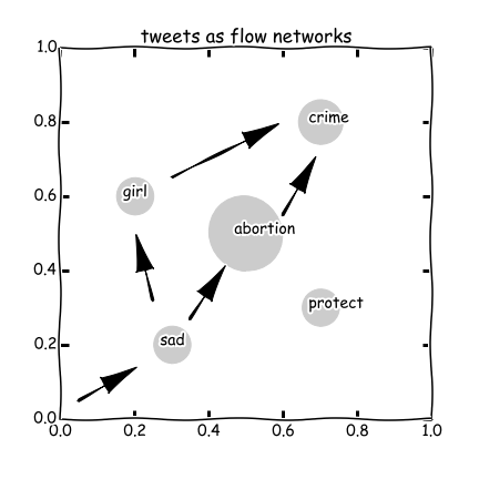
Yes, this is a blueprint suggested in our previous blog to study social movements on Twitter. In this blog, we will show you how we turn this idea into an empirical study.
First of all, we collect ‘popular tweets’ concerning a keyword using Tweet API. The developers of Twython save us from writing scripts to connect the API. All we need to do is to apply a pair of key and secret from Twitter and feed them into the functions of Twython.
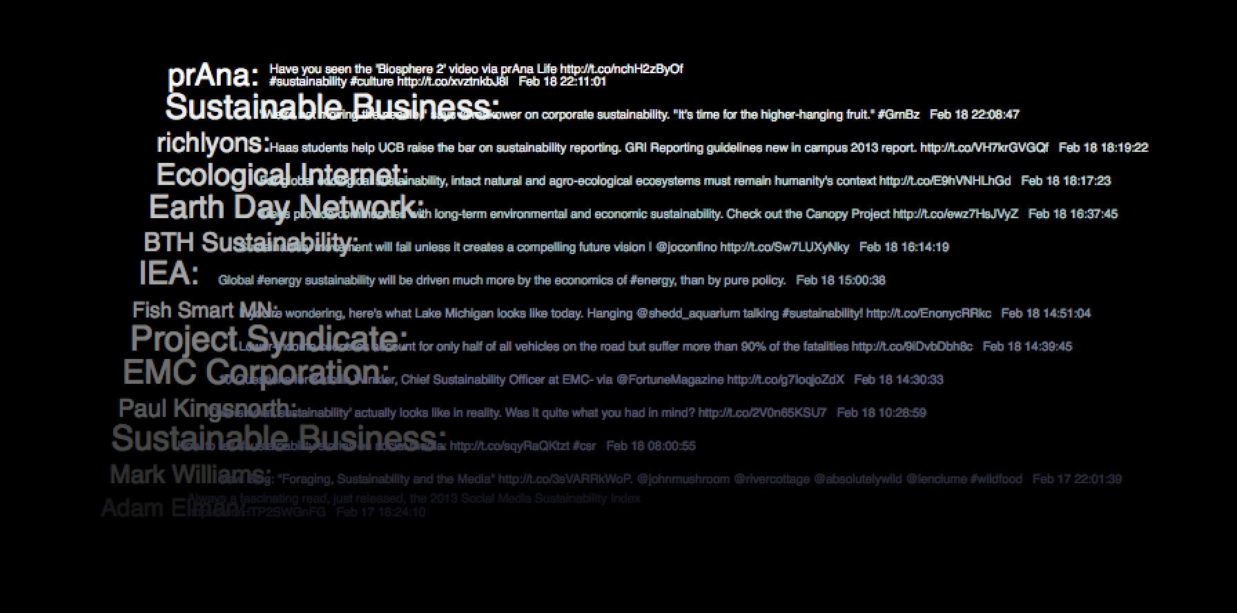
For example, by querying ‘sustainability’, we get a dozen of most relevant tweets. Including ID, tweet text, and time, etc. We do some visualization work to generate the figure below:
# import modules
from twython import Twython
import json
import re
import matplotlib.pyplot as plt
import networkx as nx
import numpy as np
import time
import random
import matplotlib.cm as cm
from collections import Counter

# set tweeter API key applied from https://dev.twitter.com/docs/api/1.1
APP_KEY = 'your own key'
APP_SECRET = 'your own secret'
twitter = Twython(APP_KEY, APP_SECRET)
directory = 'your directory'

# define stop words, which can also be imported from nltk module
sd = ['a','able','about','across','after','all','almost','also','am','among',
      'an','and','any','are','as','at','be','because','been','but','by','can',
      'cannot','could','dear','did','do','does','either','else','ever','every',
      'for','from','get','got','had','has','have','he','her','hers','him','his',
      'how','however','i','if','in','into','is','it','its','just','least','let',
      'like','likely','may','me','might','most','must','my','neither','no','nor',
      'not','of','off','often','on','only','or','other','our','own','rather','said',
      'say','says','she','should','since','so','some','than','that','the','their',
      'them','then','there','these','they','this','tis','to','too','twas','us',
      'wants','was','we','were','what','when','where','which','while','who',
      'whom','why','will','with','would','yet','you','your','via']

# define query words of interest
ks = ['Sustainability','Energy use','Recycling','Carpooling','Low carbon',
      'Carbon footprint','Flu shot','Organic','Vegetarian',
      'Vegan','Carbon neutral','Electric car']

# define function to retirve tweets from query words
def getTweets(keyword):
    t = twitter.search(q=keyword, result_type='popular')
    time.sleep(random.random())
    d=[[i['user']['name'],i['text'],i['created_at'],i['user']['followers_count']] for i in t['statuses']]
    return d

# get result and plot figure
fig = plt.figure(figsize=(12, 6),facecolor='black')
l = len(t)
cmapid = cm.get_cmap('gray', l)
cmaptext = cm.get_cmap('bone', l)
ax=plt.subplot(111,axisbg='black')
#ax=plt.subplot(111)
for i in range(l):
    ax.text((i+random.random())/2,i,t[i][0]+': ',color = cmapid(i),size=np.log(t[i][-1])*2)
    ax.text((i+len(t[i][1])/6)/2,i,str(t[i][1])+'   '+t[i][2][4:19],color = cmaptext(i),size=8)
ax.set_xlim(0,100)
ax.set_ylim(0,l+1)
plt.axis('off')
plt.show()
#plt.savefig(directory+'tweets.png',transparent=True)
In this figure the tweets are sorted in reverse-chronological order and the size of ID is proportional to the number of their followers. We can generate the above figure for any keyword, as long as Twitter provides the querying result.
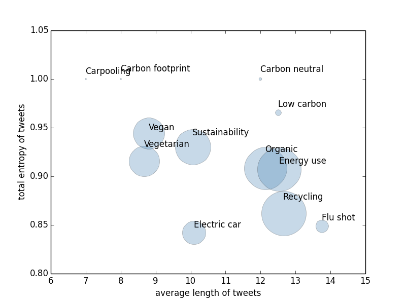
The visualization is not bad, but as scientists we do not want to stop at visualizations. So we investigate two quantities for a series of keywords, that is, the average length of tweets and the normalized entropy of all words in tweets. The stopwords, such as ‘a’, ‘the’, and ‘or’, are removed. We use the length of tweets as a measure of the efforts users willing to spend on this issue and the entropy as a measure of the level of consensus among users. The following figure shows our result.
def tokensFromATweet(s):
    s = s.split(' ')
    t = [re.sub(r'\W+', '', i.lower()) for i in s if not bool(re.search(r'^https?', i)) and i.lower() not in sd]
    return t

def H(x):
    fres=Counter(x).values()
    ps=np.array(fres)/(sum(fres)+0.0)
    en = -sum(ps*np.log2(ps))
    return en

def stat(keyword):
    seqs=[tokensFromATweet(i[1]) for i in twdic[keyword]]
    ml = np.mean([len(i) for i in seqs])
    alltokens = [i for j in seqs for i in j]
    tl=len(alltokens)
    ent = H(alltokens)/np.log2(len(alltokens))
    return [tl,ml,ent]

st={}
for i in ks:
    st[i]=stat(i)

# plot result
for i in st:
    plt.plot(st[i][1],st[i][2],marker='o',color='steelblue',
             markersize=st[i][0]/3,alpha=0.3)
    plt.text(st[i][1],st[i][2]+random.random()/50,i)
plt.xlim(6,15)
plt.ylim(0.8,1.05)
plt.xlabel('average length of tweets')
plt.ylabel('total entropy of tweets')
plt.savefig(directory + 'tweetstat.png',transparent=True)
plt.show()
Interestingly, the most controversial issue is aways carbon related. Meanwhile, the flu shot is the issue on which people willing to spend most effort to talk about. The reason could be that it is more closely related to our daily life.
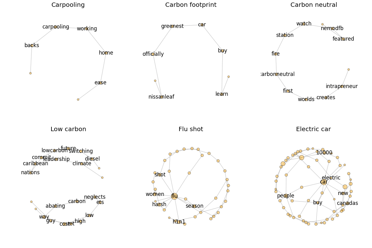
We did not forget our design of the tweet networks, in which the nodes are the words and the edges are sequential usage of two words. We construct the networks from collected tweets, visualize them, and sort them according to the number of nodes as follows:
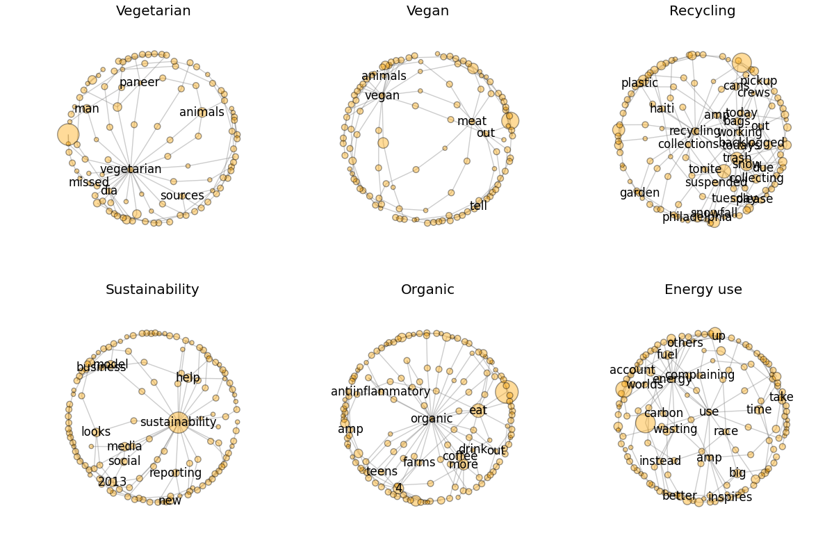
def plotQueryNetwork(keyword):
    seqs=[tokensFromATweet(i[1]) for i in twdic[keyword]]
    G=nx.Graph()
    for i in seqs:
        if len(i)>1:
            k = zip(i[:-1],i[1:])
            for j in k:
                G.add_edge(j[0],j[1])
    pos = nx.spring_layout(G)
    sizes = np.array(G.degree().values())*20
    labels = {}
    md=np.mean(G.degree().values())
    for i in G.nodes():
        if G.degree(i) > md:
            labels[i]=i
        else:
            labels[i]=''
    nx.draw(G, pos, node_size = sizes, node_color = "orange",
            alpha=0.4,edge_color='gray', width =1, with_labels= False)
    nx.draw_networkx_labels(G,pos, labels)

def networkstat(keyword):
    seqs=[tokensFromATweet(i[1]) for i in twdic[keyword]]
    G=nx.DiGraph()
    for i in seqs:
        if len(i)>1:
            k = zip(i[:-1],i[1:])
            for j in k:
                G.add_edge(j[0],j[1])
    n = nx.number_of_nodes(G)
    w = nx.number_of_edges(G)
    return [n,w]

wst={}
for i in ks:
    wst[i]=networkstat(i)
wst=sorted(wst.items(),key=lambda x:x[1][0])

fig = plt.figure(figsize=(12, 8),facecolor='white')
for i in range(6): # or range(6,12) for the rest six networks
    ax = fig.add_subplot(2,3,i+1)
    plotQueryNetwork(wst[i][0])
    ax.set_title(wst[i][0])
plt.tight_layout(pad=0.4, w_pad=0, h_pad=1.0)
plt.savefig(directory + 'tweetnetworks1.png',transparent=True)
plt.show()
We can also define the above mentioned two variables on these networks. Generally, the number of nodes and links of a network is proportional to the communication efforts people invested. And the density of the network is proportional to an issue’s controversiality. You will find that the conclusion would be very different if we use these new measurements. But as an exploration, we will stop here and leave you to think about which is the better measurement of the variables we talked about.