- The evolution of monthly number of Qs and As in 110 sites
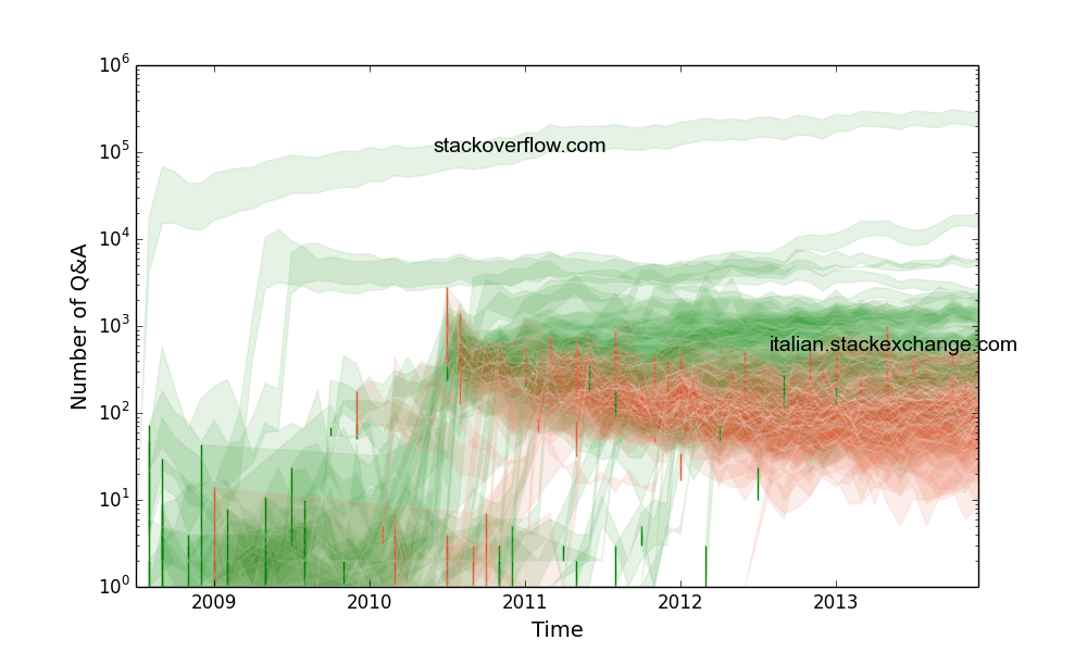
The upper and lower bound of a “band” show the number of answers and questions of a site, respectively. The increasing trends are plotted in the blue color and the decreasing trends are plotted in the red color. The increase/decrease of trends are quantifed by the positive/negative regression coefficient beta of (N of Qs + N of As)/2 on time. 56 of the sites have values of beta > 0 and 52 of them have values of beta < 0. Two extreme cases, “stackoveflow.com” (grows fastest) and “italian.stackexchange.com” (decays fastest) are shown in the plot.
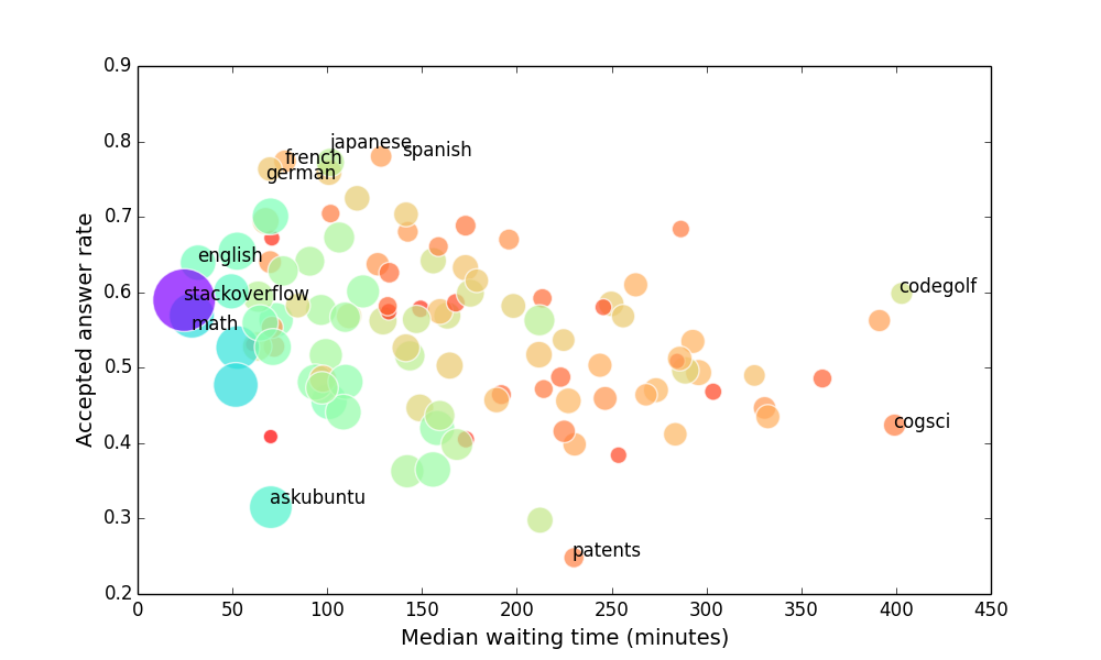
- The statistics of answer rate and waiting time of the 110 sites
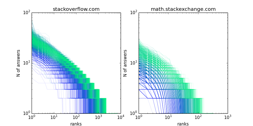
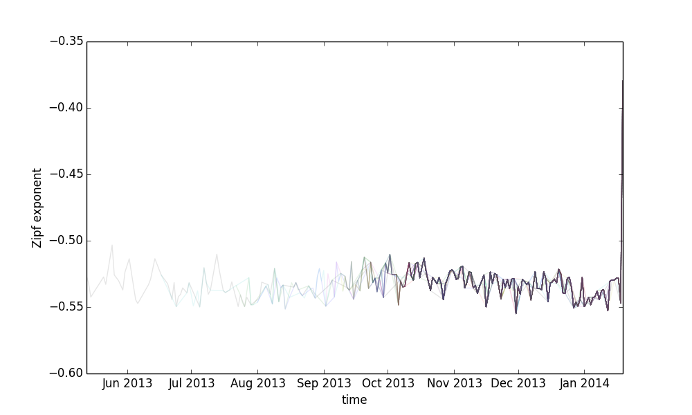
- The daily distributions of answers in two sites and the increase of inequality in answering across 110 sites
- The daily attention flow between sites
The following plot shows how users move between sites on 2013-01-01. Compared with the attention flow within sites, the scale of cross-site attention flow is very small.
4. The daily attention flow within sites The clickstrem network of "stackoverflow.com" on 2010-01-01. The nodes are the questions and the links are the sequential, collective behavior of answering questions. <!DOCTYPE html> <script src=http://d3js.org/d3.v3.min.js>